At one point in The Great Muppet Caper, Lady Holiday is going on a long explanation about her family, her job, and the fabulous baseball diamond, when Miss Piggy—whom she’s just met—interrupts to ask, “Excuse me, but why are you telling me all this?”
“It’s plot exposition,” Lady Holiday replies. “It has to go somewhere.”
Maintaining that delicate balance between too much exposition and not enough is an eternal battle for so many writers (it’s referenced at much greater length in the musical Urinetown, with a song entitled “Too Much Exposition”). In this week’s comic releases, we see two examples that miss the mark—one with so little exposition it feels like a stream-of-consciousness dream, the other with so much it starts to feel like a Wikipedia article about itself. Given the option, I’d rather have too much information than not enough; even though both books somewhat miss the mark, at least they’re part of a long tradition of writers struggling to get the balance just right.
Thanks again to Phoenix for helping to sort through the week’s new releases! Buy your comics locally!
The Least We Can Do Issue #1

Does the title of this series refer to its amount of plot exposition? Having read it, I can still only guess what it’s about. It appears that a young (secretly wealthy?) woman has decided to become a rogue thief in what might be the 1800s, a post-apocalyptic future, or a nexus of multiple universes. She joins us with a rag-tag band of… someone… who assigns her to work with… someone else, which is a point of conflict because of… a reason.
The book’s problem seems to be a lack of orienting cues: There’s a desperate shortage of indications as to where or when we are; what the main characters’ deals and goals are; what the rules of this place could be. Even on a granular, on-the-ground, moment-to-moment level, panels are drawn in a way that seems to dare the reader to orient themselves in space. I suspect that there is, in fact, a good story hidden in here, but it’s completely obscured by the way in which it’s told.
The entire thing reminded me of the Hitchcock film Dial M for Murder: Almost entirely set in one large room, the movie includes a conspicuous green lamp in many shots, which provides a cue for where the characters are, relative to the space, as they move about the set. This book has no green lamps.
Rating: 🚌 (1/5)
Writer: Iolanda Zanfardino. Artist: Elisa Romboli. Editor: Laura Tavishati. Production: Craig Arnett.
Publisher: Image.
The 06 Protocol Issue #1

A murderous madman with a mysterious agenda breaks into the home of an average suburban family… or are they?
In the wake of what seems like a random home invasion, the survivors grapple with the trauma of violence, even as information emerges that the incident wasn’t quite as random as it seemed. The bulk of issue #1 is premise-explanation, leaving it feeling a bit like an illustrated version of a show bible. Where the problem with The Least We Can Do is that it explains too little, The 06 Protocol explains a bit too much. Though that’s certainly preferable to being disoriented, I would have been satisfied if some of the explanation was held back for dramatic reveals later on. In part, I want less exposition and more action because the action scenes are so well-designed—dynamic and exciting, with fantastic twists and creative athletic combat. (There’s one gory panel that’s so audaciously violent and grindhouse-gross that it made me laugh out loud. Even the lettering shines.)
Now that we’ve explained the premise nearly to death, hopefully the next few issues can spend a little more time getting to know the characters.
Rating: 🧠🧠🧠🧠(4/5)
Writer: Lee Turner. Artist: Cliff Richards. Colorist: Matt Herms. Letterer: Cardinal Rae.
Publisher: AfterShock.
Revenge of the Librarians

Never have I encountered a book that is so perfectly suited to be given as a gift to a librarian, writer, or book lover in your life. It’s a whimsical collection of stand-alone strips that joke about literature and libraries, drawn in a clean, cute style that’s quite easy on the eyes. One page imagines collective nouns for literary gatherings: “A blurb of publicists,” “a stanza of poets,” a “gruop of proofreaders.” Another suggests various literary conflicts, such as “writer vs dog who wants a walk.” If these little japes made you chuckle knowingly with a wry smirk, I suspect the book has done its job.
As always with Drawn & Quarterly titles, the volume is beautifully bound, with a sturdy hardcover, a touch of gilt, and a clever fake library-stamp pocket on the inside cover. No great insights or surprises will leap from the page; this experience is perfectly engineered to be cozy. Exchanging it with someone you know is an excellent way to tell them, “I like books, too.”
Rating: 📖📖📖📖 (4/5)
Writer & illustrator: Tom Gauld.
Publisher: Drawn & Quarterly.
Also: Comics! Mazes! Games!
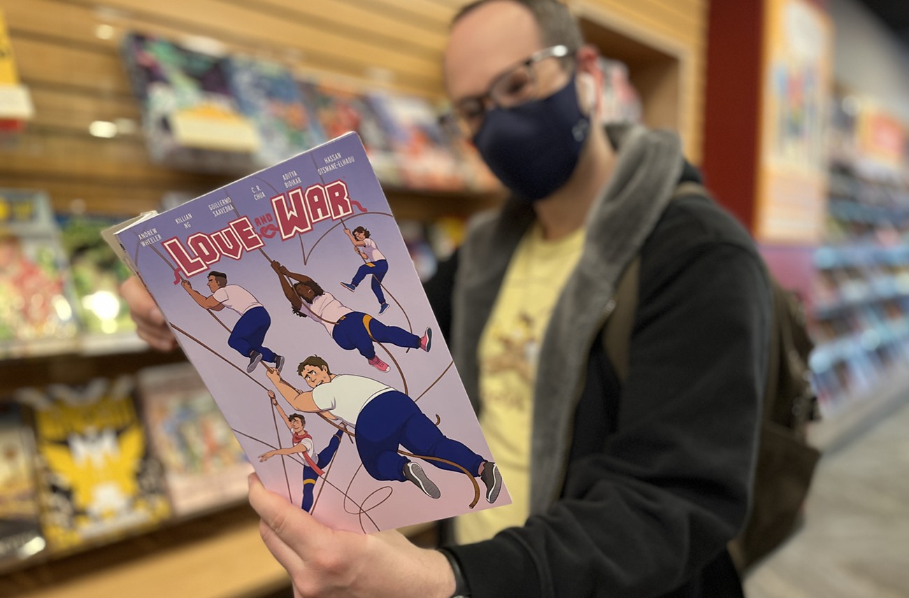
Some other titles to tickle your fancy this week: Love and War is a cute coming-of-age queer rom-com about, what else, tug-of-war teams. There’s a new Star Trek: Lower Decks comic that looks like a very faithful companion to the show; also a gorgeous new series penned by Kevin Smith entitled Maskerade that looks like exactly what his fans would want. DC offers a gorgeous, thick Watchmen: The Annotated Edition for superfans, and a cute little indie book called Adventuregame Comics: Leviathan promises comics, mazes, and games. I’m also intrigued by Supper Club, which looks like a young-adult slice-of-life book about comfort foods (from Image, unexpectedly, and not as I assumed from Oni). Also, there’s a new Batman vs. Robin that, as usual, requires extensive prior knowledge of past issues, but at least it has some very attractive variant covers.